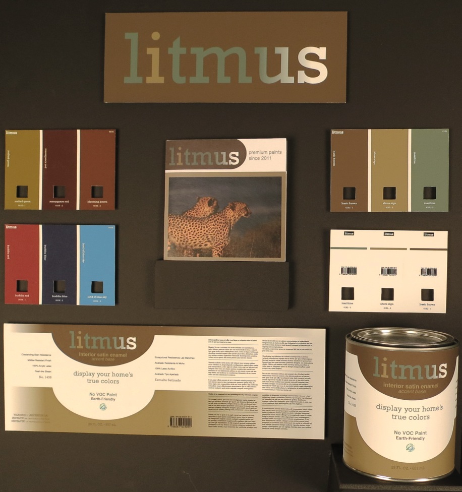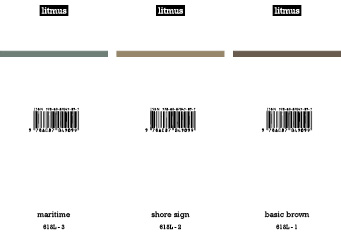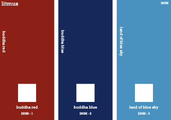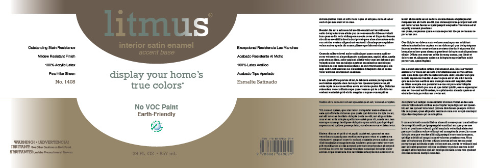
Litmus Paint Identity
This project was an academic assignment to create an identity for a paint brand of our design. I chose the brand name "Litmus" in reference to a litmus test which identifies the qualities of a substance. The letter "i" is highlighted because it is meant to represent the importance of the consumer in their choice of color. A selection of earth-tones were used to indicate the earth-friendly nature of the company and to focus on the colors in the can, not on the can.